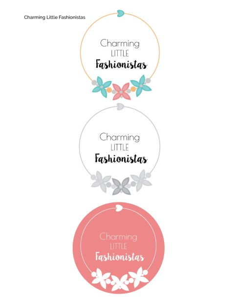
Description: Logo for a company
Process: For this project I started out creating three different logo types, all with different fonts, shapes, and colors. Then I had people vote on their favorite one, and I chose this logo to refine and use. For the necklace on the logo I used the pen tool in Adobe Illustrator to create the different shapes. I also refined my typography so that it was all legible and easy to find out what company the logo was for. I made sure the spacing between the text and the design was equal on both sides, and then picked out colors from the visual focus color wheel to add to my design.
Programs Used: Adobe Illustrator
Message: Charming Little Fashionistas is a blog where you can find great fashion tips and advice
Audience: Those who are into fashion or like to follow blogs
Top Thing Learned: How to draw with the pen tool
Color Scheme and Color Names: Split complementary – Teal, red and orange
Title / Body Font Names & Categories: Font 1– Poiret One- sans serif Font 2– LilyBelle- Script

I love your design! The design totally matches your message, which creates unity. Your color scheme is cute and fun which also matches the company. Your typography contrasts well and I like that the word “little” is in all caps. The design also looks good in all the different versions, so the versatility is good.
LikeLike
You should check out this design: https://bendesigning.wordpress.com/category/visual-media/design/
LikeLike
This is so cute! I love the color scheme. I also like the circle. I think that it is more feminine than a square or hard edges. I also like the circle details. It looks almost like a necklace and is super cute in the design. Nice job!
Please check out my blog!
https://chelseaforsyth.wordpress.com/category/visual-media/
LikeLike
Your logo is very unique, I like the what you did with the flower designs! My favorite is probably the pink one! I like how it just adds a little more color into the design. Great job.
https://discoveryourstrengthblog.wordpress.com/
LikeLike
Hey there Malarie! I like your logo design. The name stands out to me because of the two different typefaces, but also because of the name itself. It is creative, punny and spunky with an element of cute that can’t be overlooked. I think the three different color versions are all very good looking. Your message would definitely grab the attention of the audience you are searching for! Well done 🙂
Ben did a cool job with his logo! Pop on over if you haven’t already seen it!
https://bendesigning.wordpress.com/2016/06/05/project-5-logos/
LikeLike